

Fostering humanity at work.
Gusto offers payroll, benefits and HR to over 100,000 small businesses. We had grown significantly, but the brand hadn’t grown with us.
We rebranded in order to establish an insight-driven brand positioning, and to create an engaging, differentiated, and scalable visual design system and brand voice.
I had the opportunity to work as a part of the team that crafted an entirely new visual identity for Gusto in 2019.
Creative TEAM
Micah Panama, creative director
Jenna Carando, design & art direction
Natalie Schoch, design & art direction
Ellen Ennes, copywriting
Koto, visual exploration & illustration
I collaborated alongside a handful of talented Gusto and Koto teammates on this rebrand. I worked directly on:
the logo
color palette
typography
photography art direction
internal and external swag
social media
out-of-home advertisements
The state of the brand
The Gusto brand had been fun, quirky, and friendly, but didn’t reflect the trustworthiness of our product. Peoples’ livelihoods and small businesses depend on Gusto, and we weren’t showing that we were a reliable partner. We showed up differently across the web, in the product, on social, in our campaigns, and in our office space. Despite the inconsistencies, it was a beloved brand and we didn’t want to lose that.
Prior to Gusto’s rebrand
Research and brand positioning
We worked with an external agency to conduct internal and external interviews with employees and customers. Our goal was to get to the heart of what sets Gusto apart. What emerged was a clear understanding of what matters most to the majority of business owners — their people. They care about creating a culture that fosters development and a shared sense of purpose, while building strong relationships with their team. They want to care for their employees, taking their personal prosperity into account. Gusto has the opportunity to help facilitate and strengthen these connections.
This research informed our people-centric brand positioning — Gusto fosters humanity at work.
To make work meaningful, we must embrace what it means to be human — in both heroic moments and difficult ones. We deliver sophisticated technology with unique and authentic personality. We’re not afraid to be different, to be real, to do the hard thing.
We serve remarkable humans. We have to be remarkably human too.
This positioning informed our brand attributes and set the stage for our visual explorations.
Visual exploration
A small group of designers and writers explored visual extensions of our newly minted brand positioning, evaluating font pairings, testing color palettes, photography art direction, and logo concepts. After many rounds of exploration, mockups, presentations, and discussions, we aligned on a brand philosophy that became our North Star — a balance between warmth and sophistication. Warmth is how we show people we care; sophistication is how we earn people’s trust. In order to establish ourselves as both human and trustworthy, we needed to balance warmth and sophistication across all brand touch points.
Early visual exploration
Logo design
The team knew we wanted a typographic logo that reflected our brand attributes: heartfelt, determined, mighty. We wanted it to feel friendly, simple, mighty, energetic, and approachable. The word “gusto” means to do something with passion and enthusiasm, but the logo didn’t need to carry the full responsibility of expressing that. We explored a wide array of solutions, but continued to gravitate towards something that felt simple and friendly.

A handful of my logo sketches
Bringing the brand to life
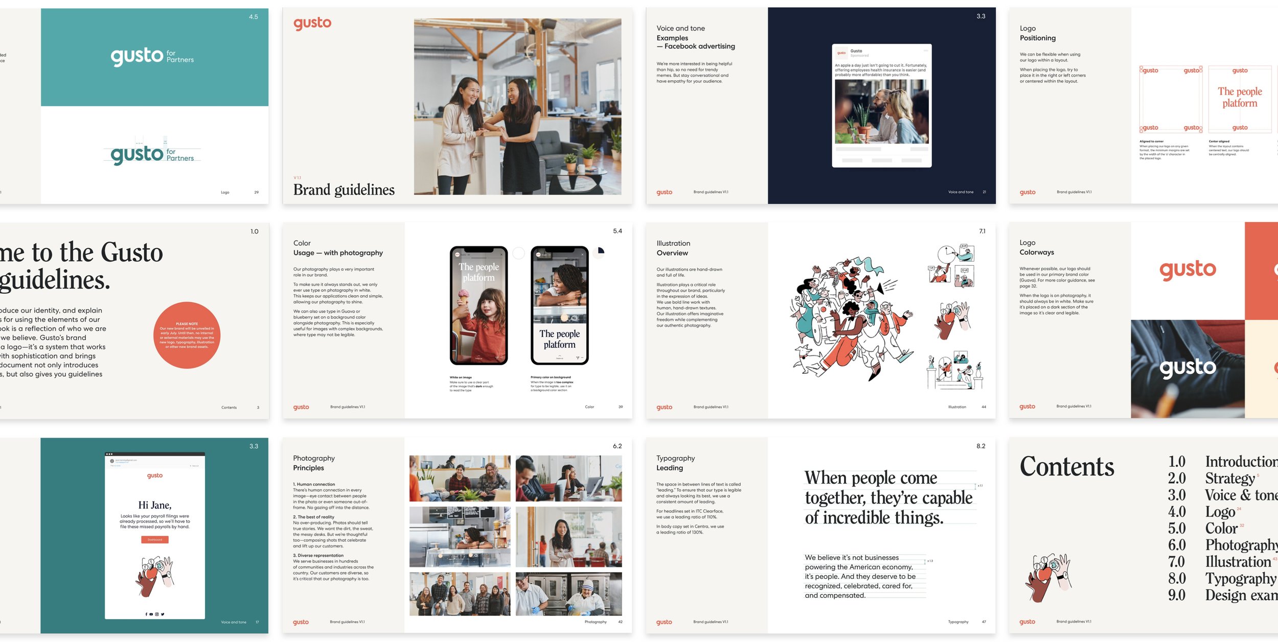
After weeks of iterations, we landed on a final design system consisting of a new logo, color palette, typography, art direction, illustration, voice and tone. A comprehensive set of brand guidelines tie the identity together. You can see the full brand overview at gusto.com/brand.
A MIGHTY Logo
I custom drew each letterform for the logo, featuring approachable, friendly, rounded letters, a mirrored circular bowl in the g and o, and the subtle smile in the lowercase g.

Final logo animation by Salih Abdul-Karim
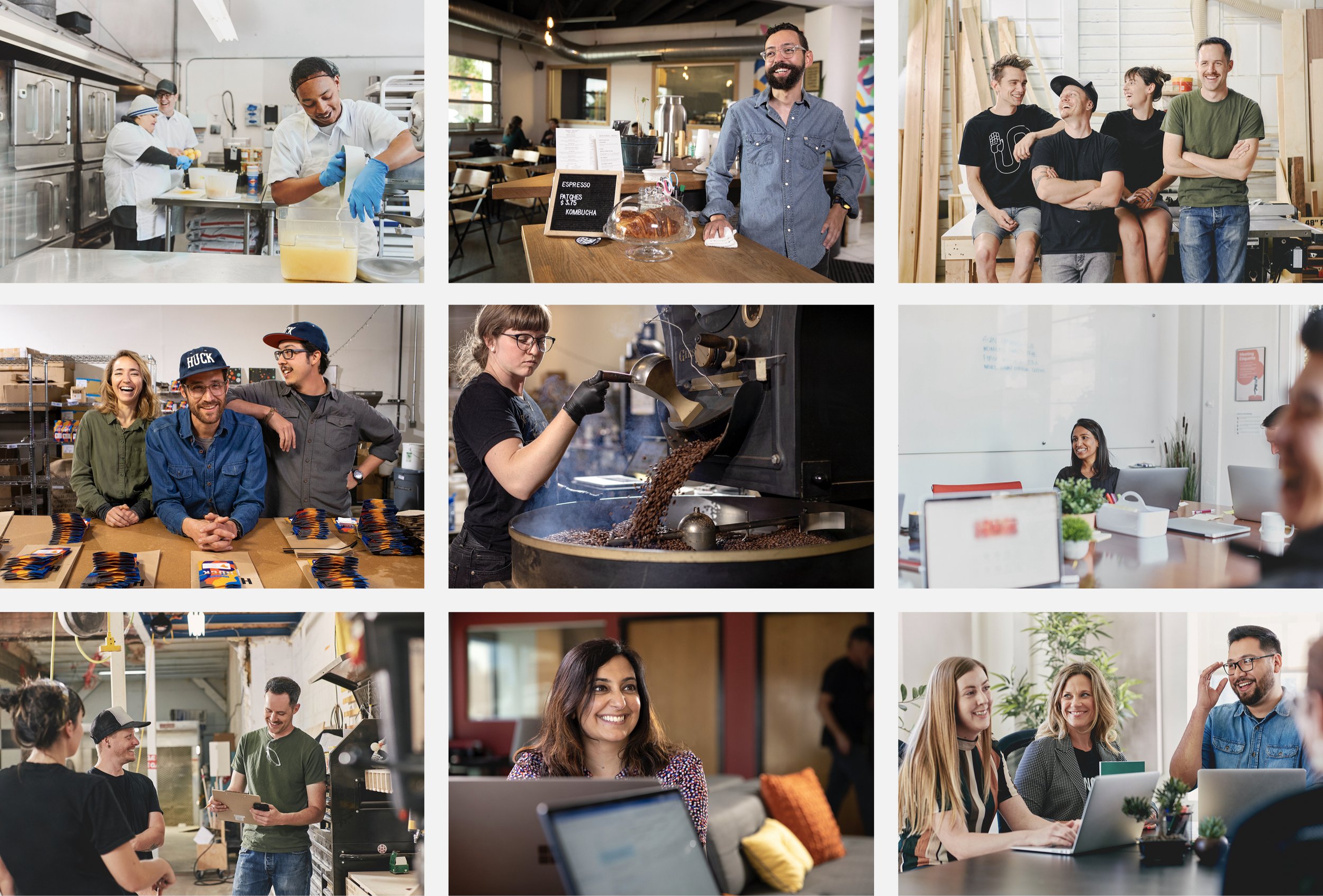
People first photography
Photography is at the core of our brand, allowing us to capture real people doing real work, in their actual workspaces. I put together endless references and mood boards for our photography style, and then art directed 10 shoots in various cities with actual customers. The style is intended to be authentic, not perfectly posed, to reflect the reality of owning a business. The photos focus primarily on people working together, connecting with one another.
A hand-drawn touch
Illustration helps us to express ideas through bold line work and a human, hand-drawn texture.
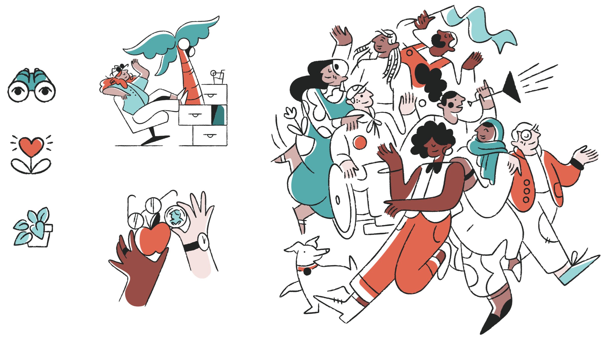
illustrations by Meredith Schomburg
A vibrant and spirited palette
Guava is a sophisticated evolution of the previous red used in the brand, paired with plenty of white space and hints of Kale.

A flexible typography system
Headlines are in ITC Clearface, a personality-packed serif font that stands out among the default sans-serifs of the industry. Centra is our secondary typeface, a contemporary sans serif that’s accessible and unpretentious — perfect for longer text and product writing. I also had the opportunity to create a tertiary custom, hand-drawn font, used sparingly to represent a customer’s name or signature.
The brand in action
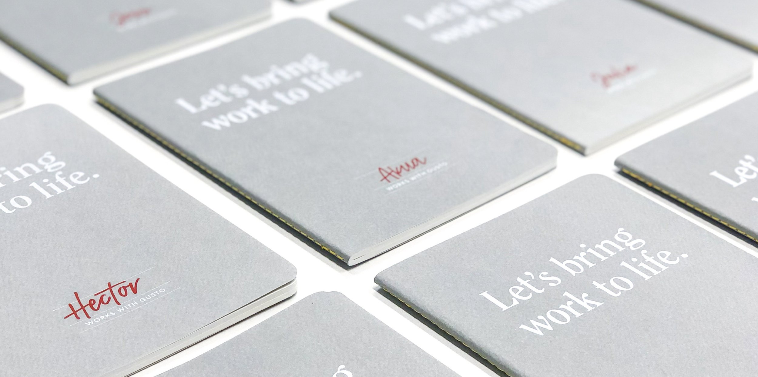
Notebooks for employees featuring hand-written names

Postcards for employees outlining our new positioning
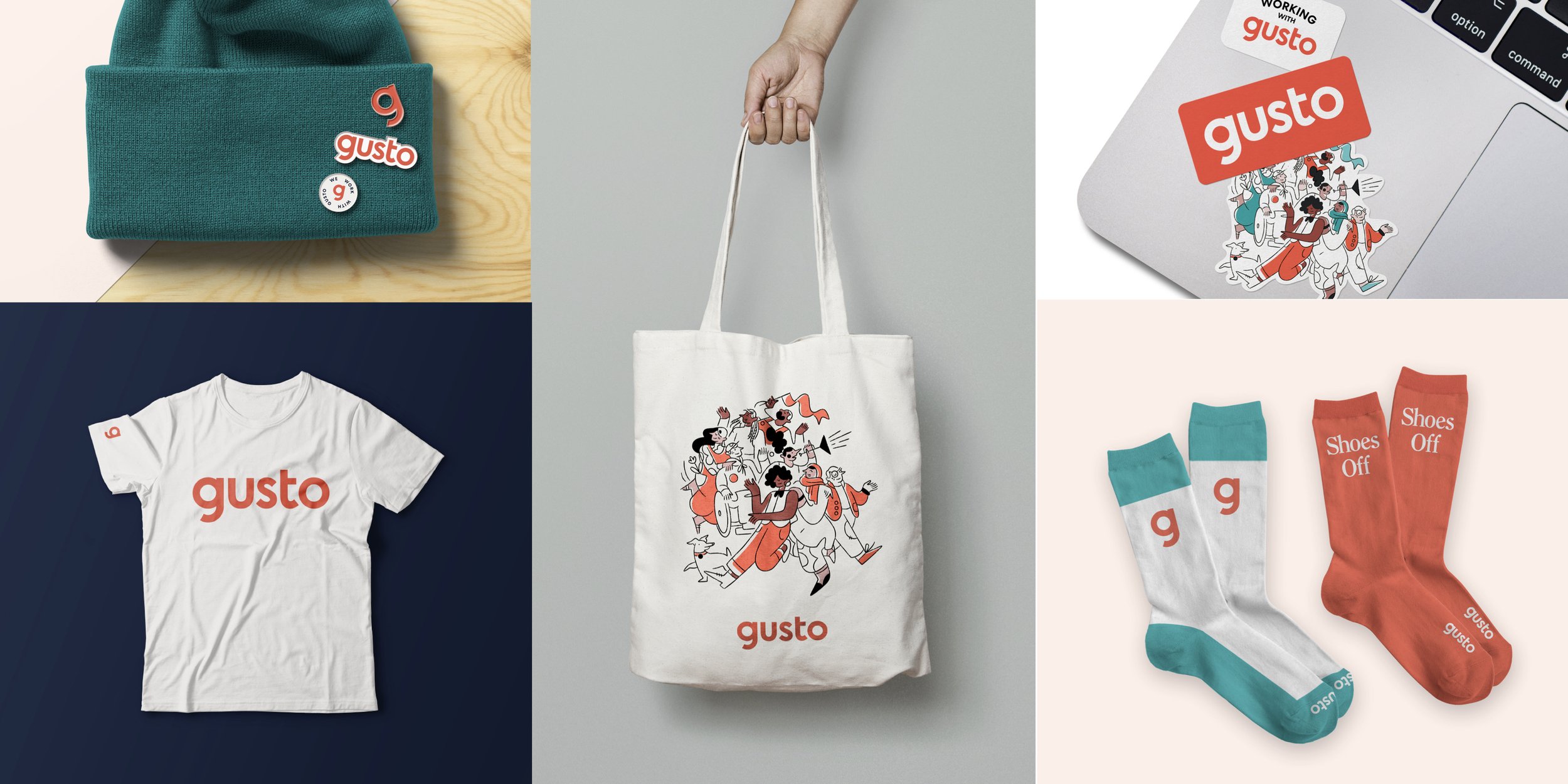
A suite of fresh swag
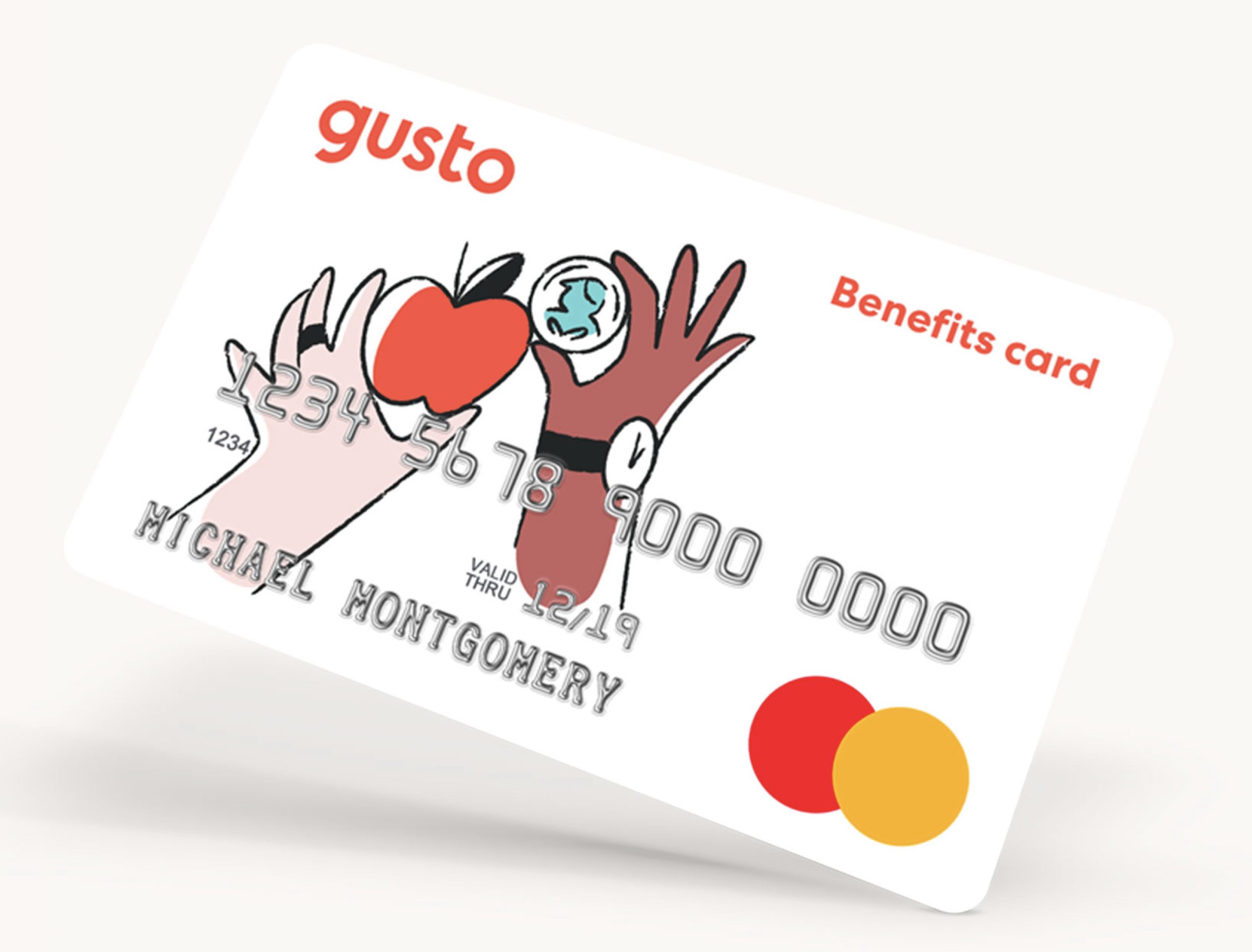
Gusto’s benefits card, one of the few physical touch points customers have with the brand
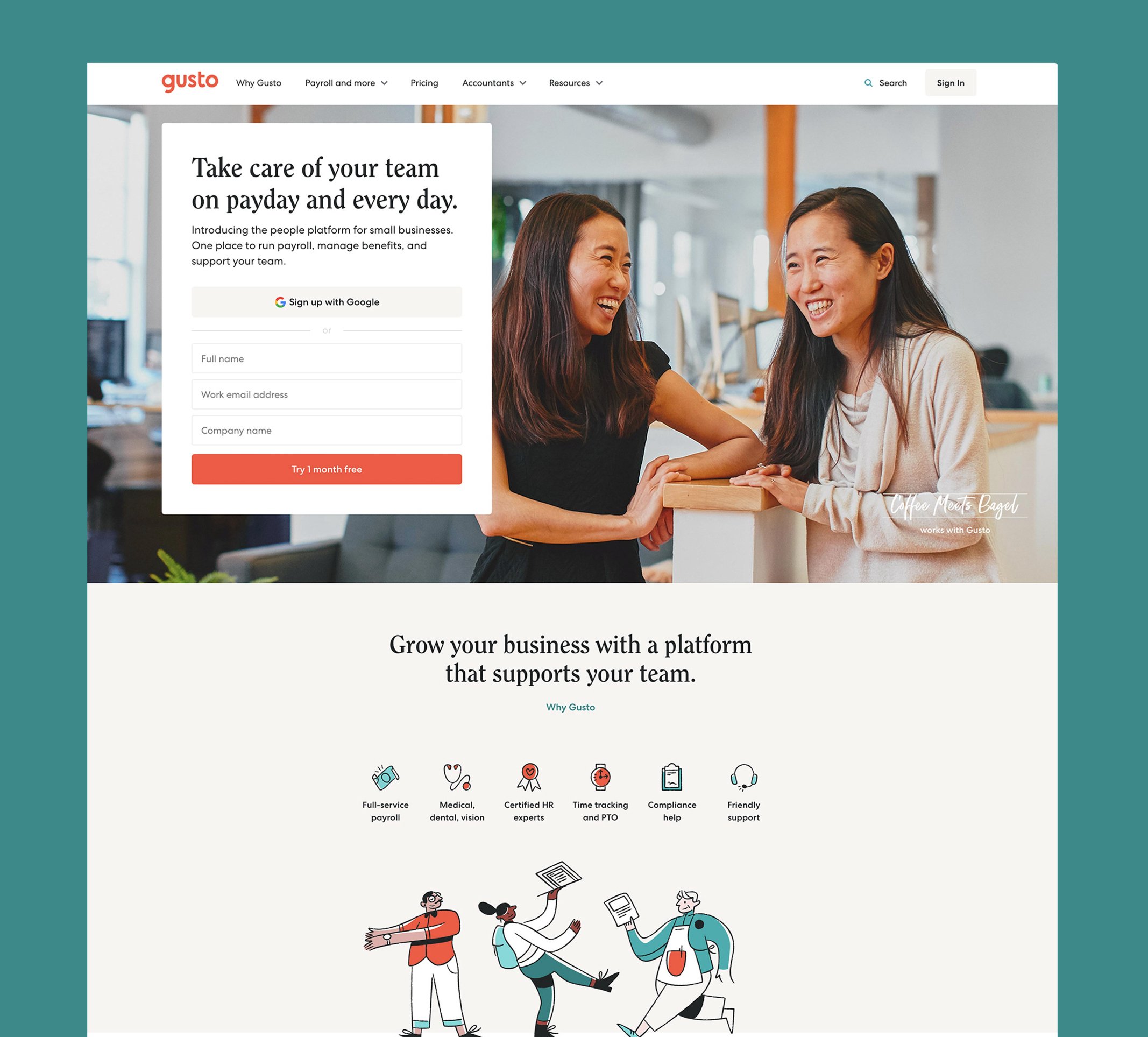
Website refresh

Redesigned product
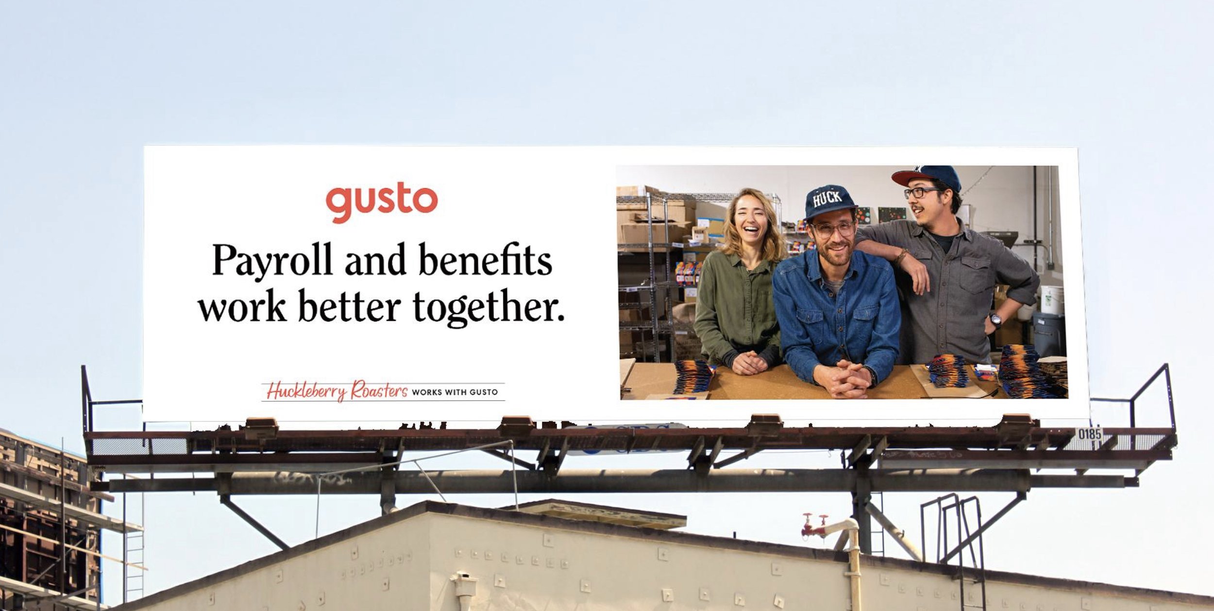
OOH campaign to drive brand awareness

The OOH campaign I designed spanned across 3 cities, and included billboards, transit shelters, bus kings, and car tops